Infographic: What Do Your Country's Emissions Look Like?

In the past couple of weeks, climate change has captured the headlines: Leaders of the G7 agreed to a decarbonization of the global economy over the course of this century; Pope Francis released his long-awaited Encyclical on climate change; and Morocco and Ethiopia joined the U.S., EU, and other countries in putting forward its plans for post-2020 climate action. More countries are expected to release their own post-2020 climate commitments in the coming months, and all of these actions set the stage for a new international climate agreement to be finalized at the COP 21 climate summit in Paris in December 2015.
But before we look ahead, it’s important to also fully understand the current state of global emissions.
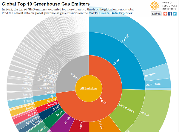
Leveraging data from WRI’s CAIT Climate Data Explorer, the dynamic graph below allows you to explore just-released CAIT emissions data for 2012 by country and economic sector, and share this information on social media.
This picture of global emissions tells a number of stories:
The largest emitters contribute a majority of global emissions. The top 10 emitters1 contribute 72 percent of global greenhouse gas emissions (excluding land use change and forestry2 ). On the other hand, the lowest 100 emitters contribute less than 3 percent. While universal climate action is necessary, significant mitigation actions are needed by the largest emitters, taking into account that they have different capacities to do so.
The energy sector is the dominant source of greenhouse gas emissions. The energy sector contributes more than 75 percent of global greenhouse gas emissions. A rapid transformation of the energy sector by 2050, as the G7 suggested in their recent announcement, is necessary to avoid the worst impacts of climate change.
Emissions sources vary by country. While the energy sector dominates, industrial emissions in China contribute more than 3 percent of global emissions and new data from the Food and Agriculture Organization (FAO) indicate that agriculture contributes a notable share of Brazil’s and Australia’s emissions. Mitigation policy options that countries pursue should therefore align with their national circumstances.
Six of the top 10 emitters are developing countries. According to the data, China contributes approximately 25 percent of global emissions, making it the top emitter. India, Indonesia, Brazil, Mexico and Iran are also contributing relatively large shares of global emissions as their economies grow. Although developed countries used to dominate the list of top 10 emitters, the visual represents the changing emissions (and geopolitical) landscape. It is important, however, to consider a range of indicators that help differentiate the responsibility and capability of countries to act.
Per capita emissions are still distributed unequally. The graph below highlights that per person emissions still vary among the top 10 emitters, with the United States’ per capita emissions eight times those of India. Explore these differences further in our 6 graphs that explain the world’s top 10 emitters.

Facebook comments